A complete identity designed for consumer confidence.
The EasyBeds system is intentionally simple: one memorable name, one clear promise and a visual language capable of working across physical and digital applications.
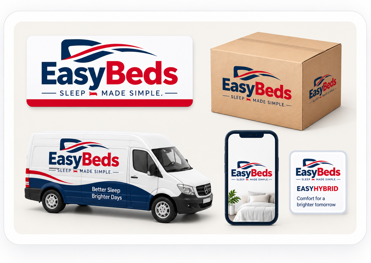
Clean, soft and modern.
A wordmark-led identity combines deep navy for trust with a restrained red accent for energy and recall. The bed-and-wave symbol suggests comfort and movement without becoming overly literal.
- Primary tagline: Sleep Made Simple.
- Personality: calm, reassuring, approachable and quietly confident.
- Tone: clear rather than technical; useful rather than sales-heavy.
Trust, warmth and clarity.
A limited palette keeps EasyBeds distinctive while leaving room for product photography, textiles and interior styling.
Readable enough for utility. Refined enough for brand.
A modern humanist sans-serif keeps the system accessible across ecommerce, packaging, signage and corporate presentations.
Typography
Recommended: Inter, Avenir Next, Aptos or equivalent. Strong weights for headlines; generous spacing and highly readable body copy.
Iconography
Rounded-line icons with restrained detail and consistent weight. Avoid cartoon styling and decorative clutter.
Photography
Premium but natural bedroom environments, tactile materials, soft daylight and real-world warmth rather than glossy showroom imagery.
One idea, expressed at different levels.
The system keeps consumer language simple while giving corporate and commercial audiences enough depth to understand the brand opportunity.
Consistency creates perceived quality.
The system is intentionally disciplined so future packaging, ecommerce, advertising and environments can feel unmistakably related.
Space
Use generous margins and restrained content density. The brand should never feel crowded.
Colour
Navy leads; warm white creates calm; red is used selectively for recognition, action and emphasis.
Type
Large editorial headlines paired with highly readable body typography and simple information hierarchy.
Imagery
Natural, tactile and believable. Prioritise atmosphere and materials over generic catalogue presentation.
Modern bedroom comfort, made easier.
EasyBeds is positioned as a scalable bed and bedroom lifestyle brand concept that turns category complexity into a clear, friendly consumer experience.
Comfort
Products and experiences designed around how people want to feel.
Quality
Dependable materials, thoughtful design and clear product logic.
Everyday Living
Practical solutions for real bedrooms, real homes and changing lifestyles.